Identity Foundation
Focused direction, primary logo system, color, typography and a concise usage sheet.
$750
Branding & Visual Identity / Lexington, Kentucky
Branding and visual identity shaped around how a business wants to be seen and remembered.


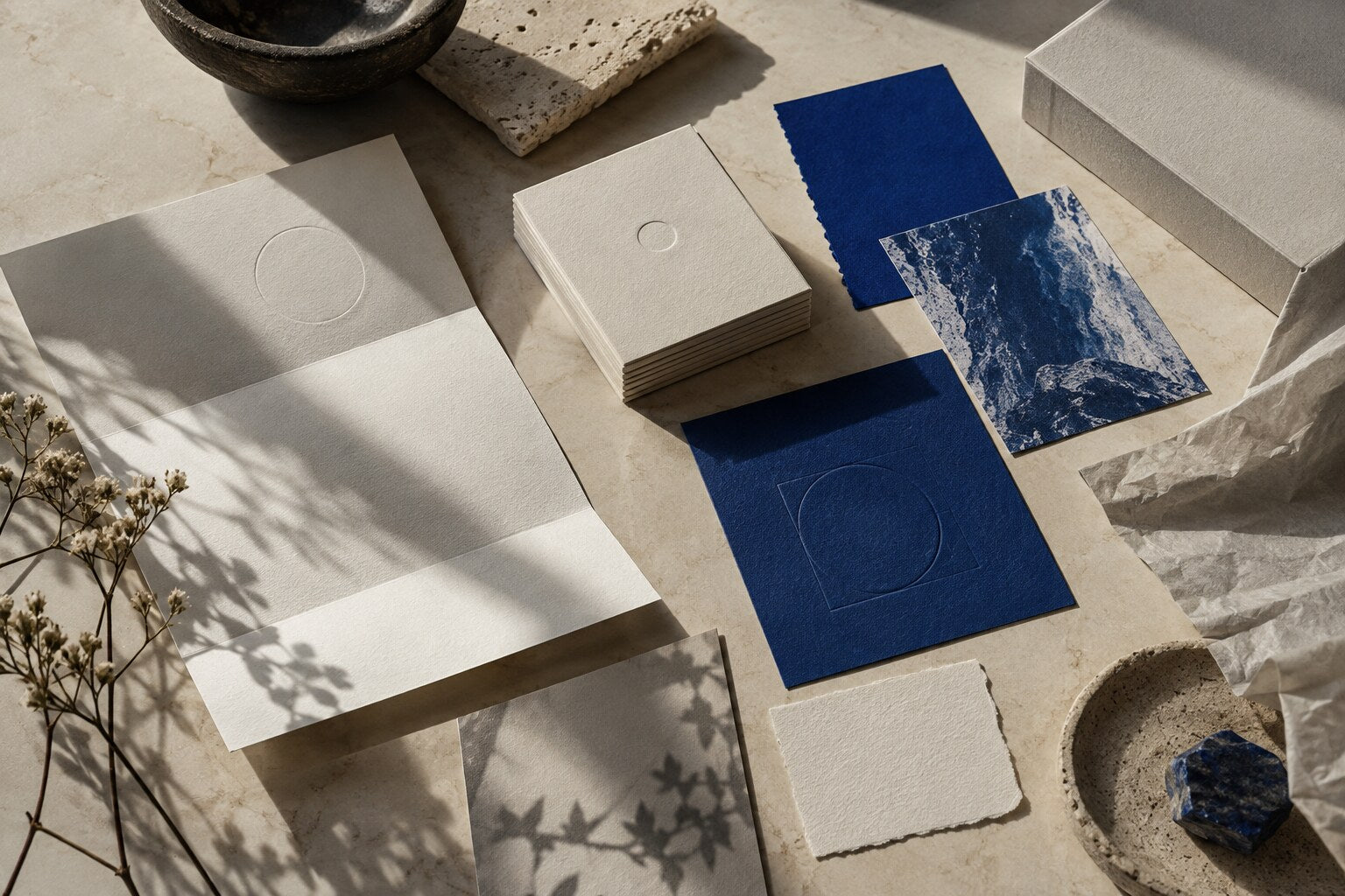
A visual identity should feel considered at every scale. From the first impression to the smallest detail, LITOMNIA CORP develops a consistent visual language for a brand.
We begin with context, audience and intended use. The visual system follows the direction—not the other way around.
One identity. Many points of contact. We build the visual system, then show how it works across the places where people meet your brand.
Focused direction, primary logo system, color, typography and a concise usage sheet.
$750Research, two directions, responsive logo family, graphic language, three applications and guidelines.
$1,450Full identity system, five agreed applications, production-ready files and expanded usage guidance.
$2,400Ongoing art direction and controlled extension of an existing LITOMNIA visual system.
$450 / month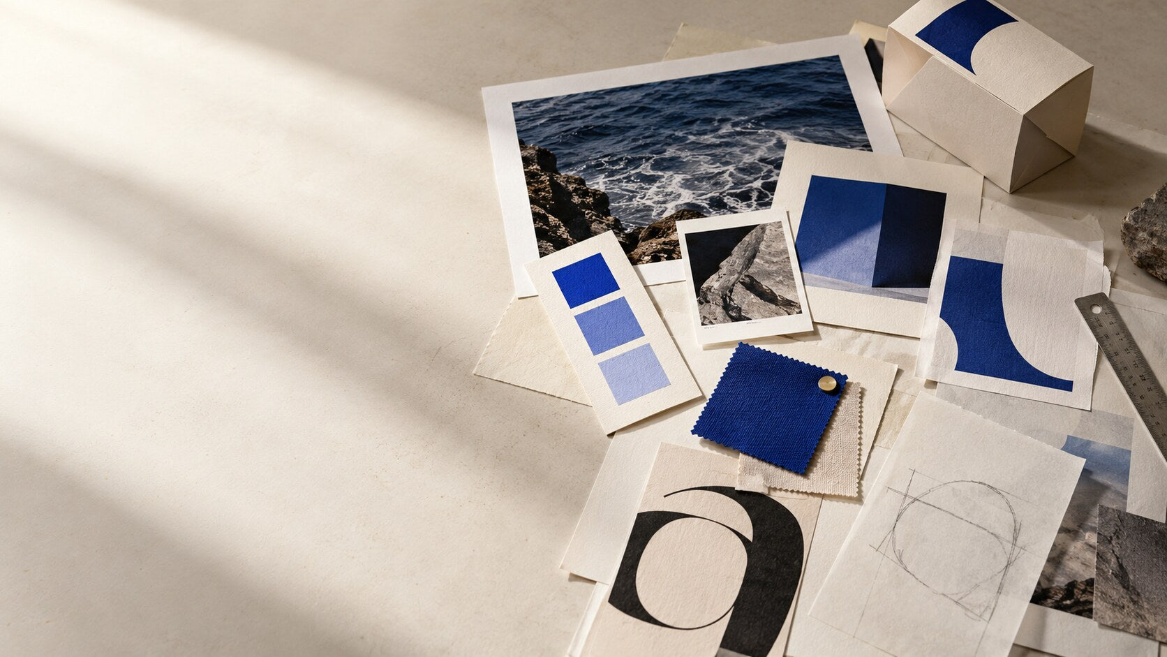
A useful identity is not built from taste alone. Before design begins, the project needs clear answers about recognition, context and practical use.
01 What should be recognized first?
02 Where will the identity appear most often?
03 What must remain consistent as the business grows?
04 Which production limits shape the system?
Concept studies demonstrate the intended range of the studio. They are not presented as commissioned client projects or measured results.
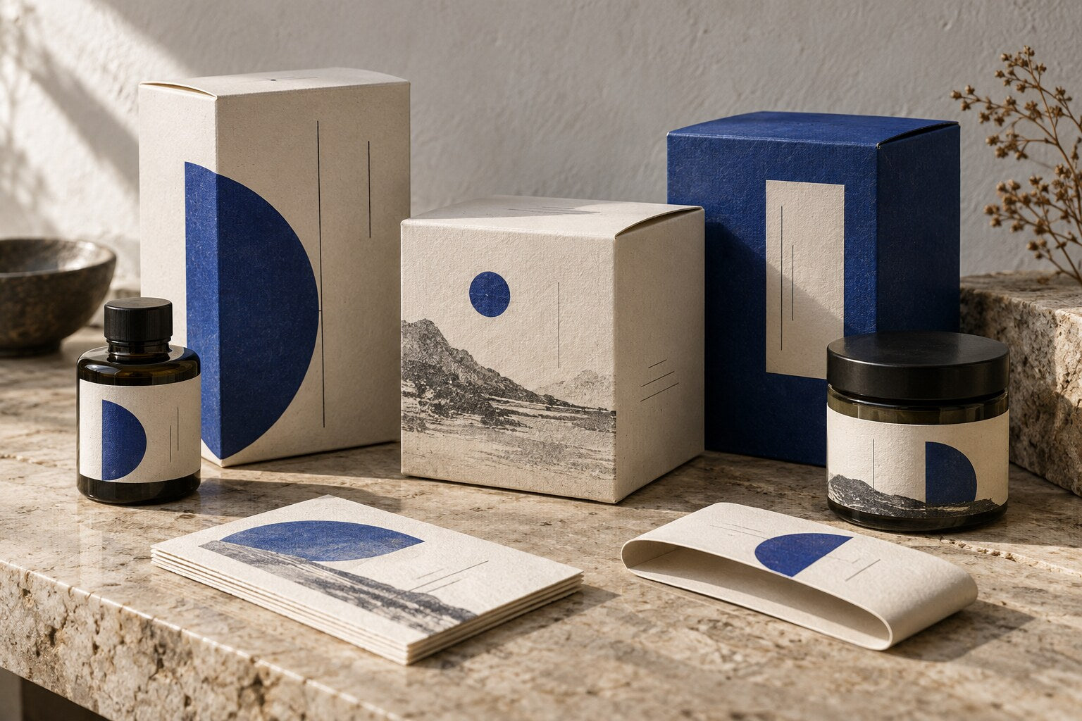
An exploration of how one graphic language remains recognizable across labels, folded cartons and uncoated paper.
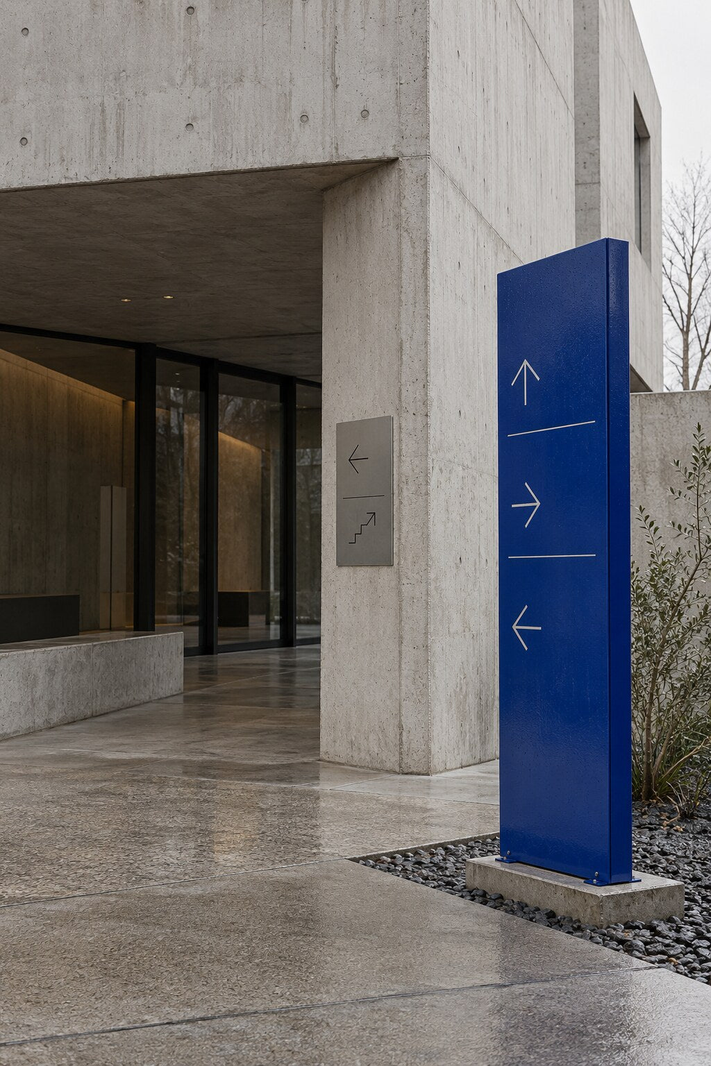
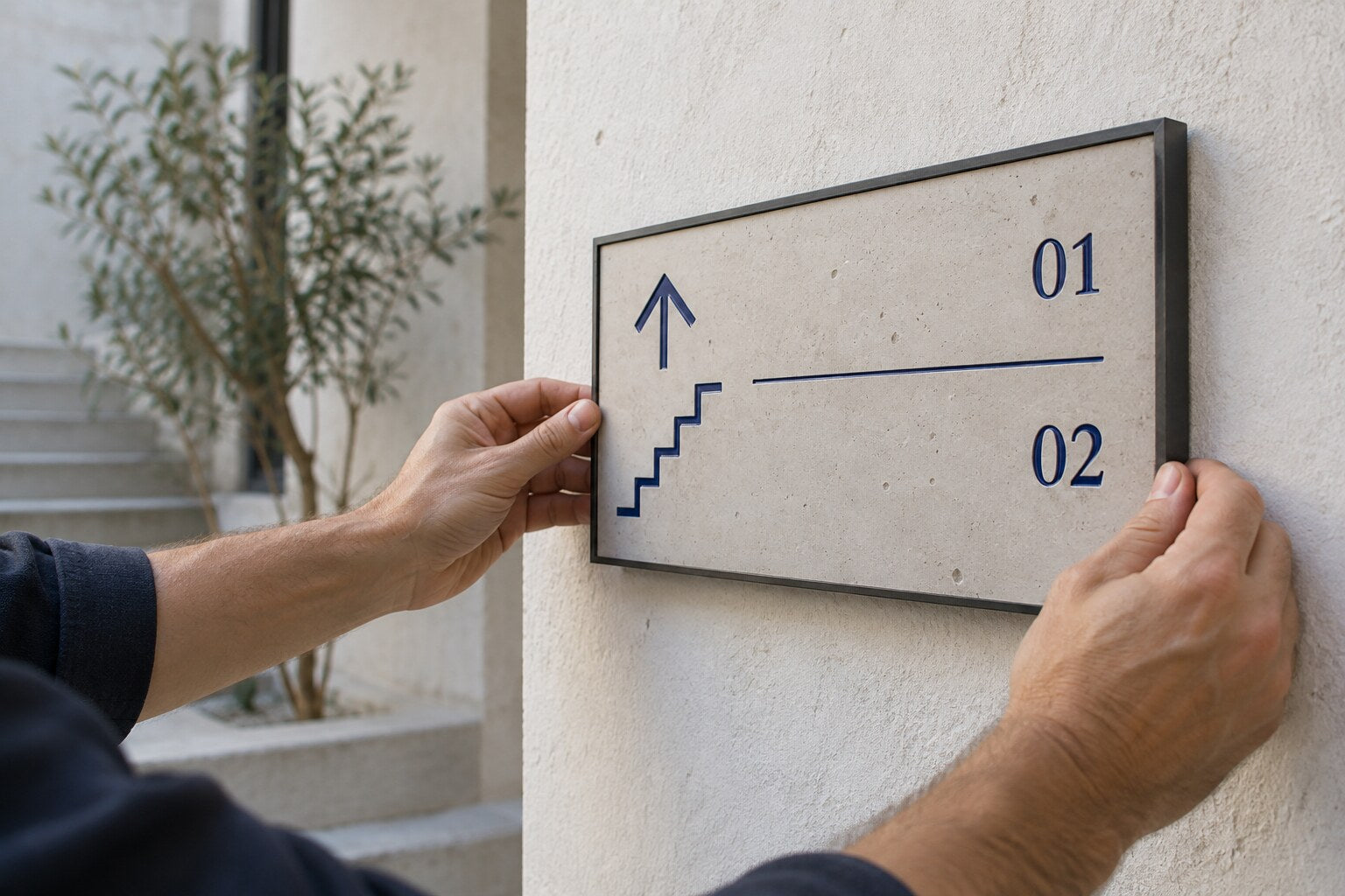
A spatial identity study focused on proportion, legibility and recognition as a person moves through a physical setting.
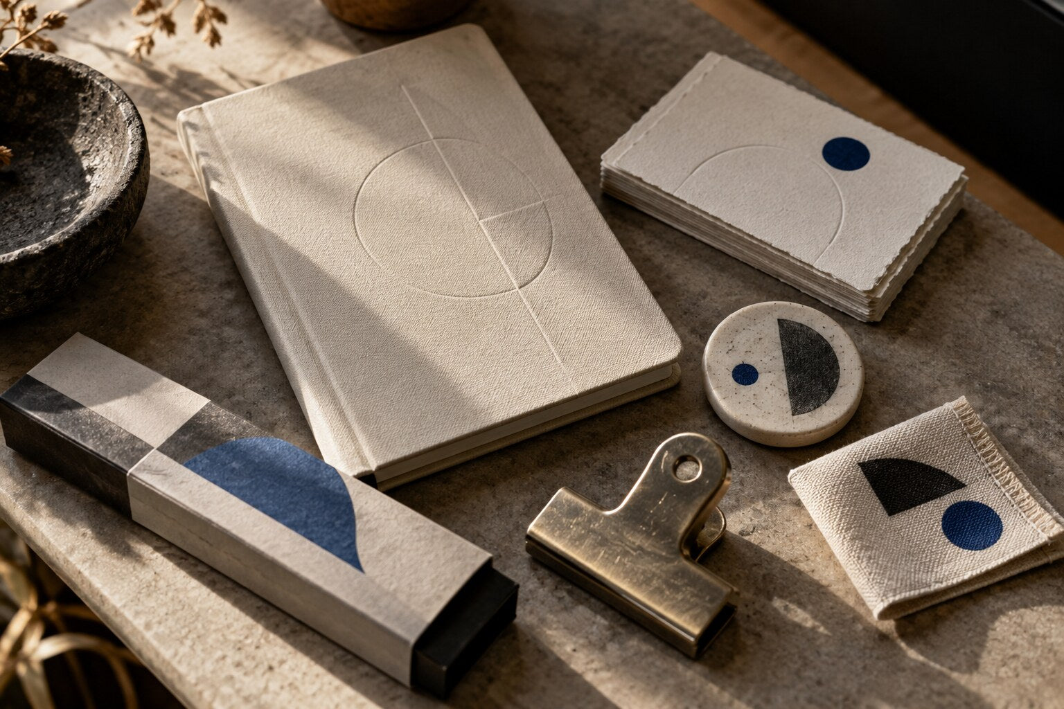
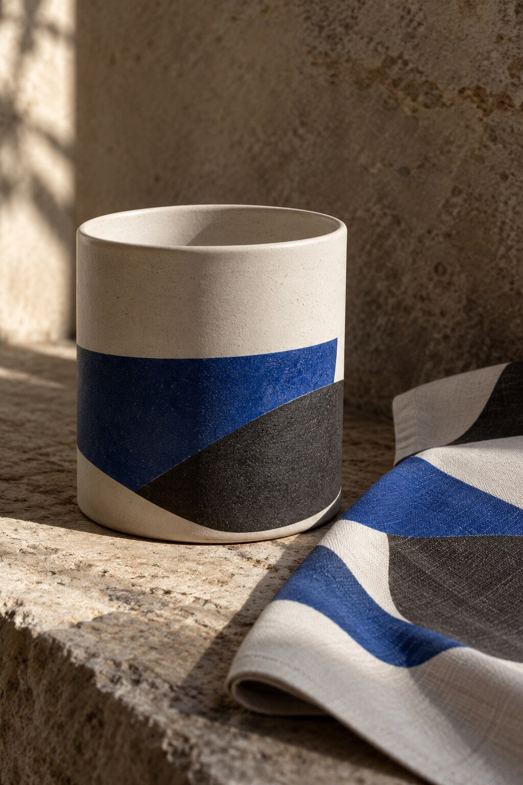
A study of typographic detail, restrained color and material contrast on objects designed to be held and revisited.
We clarify the business context, audience, practical needs and visual territory.
We agree on a focused direction and the criteria the identity must meet.
We build, test and refine the system across the applications in scope.
We prepare organized files and clear guidance for consistent use.
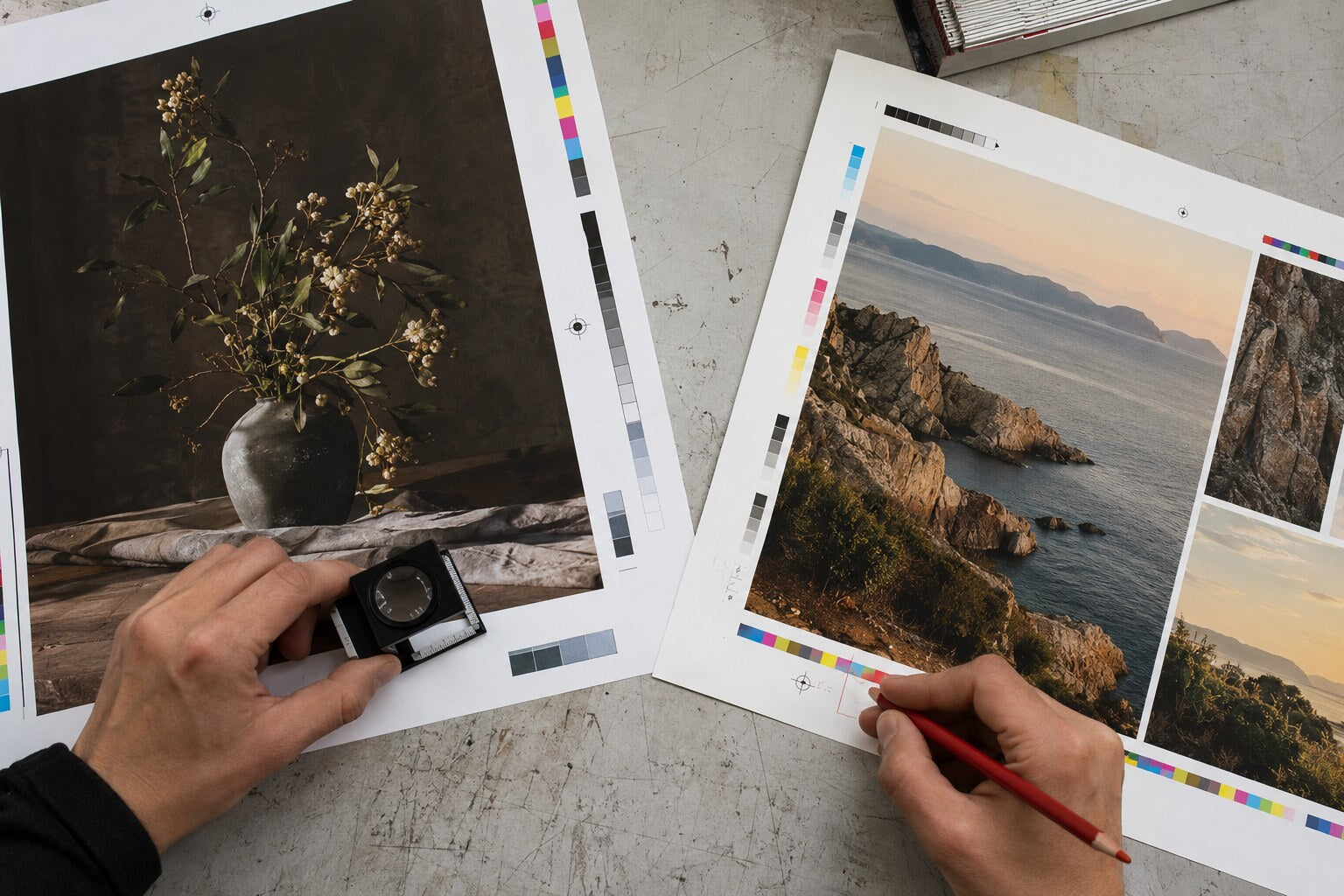

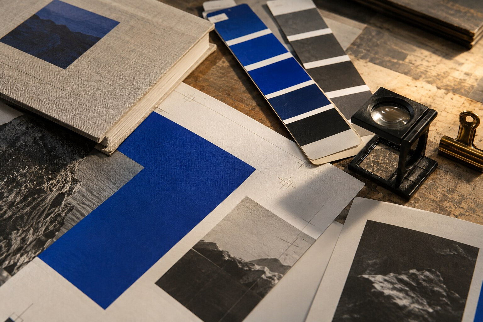
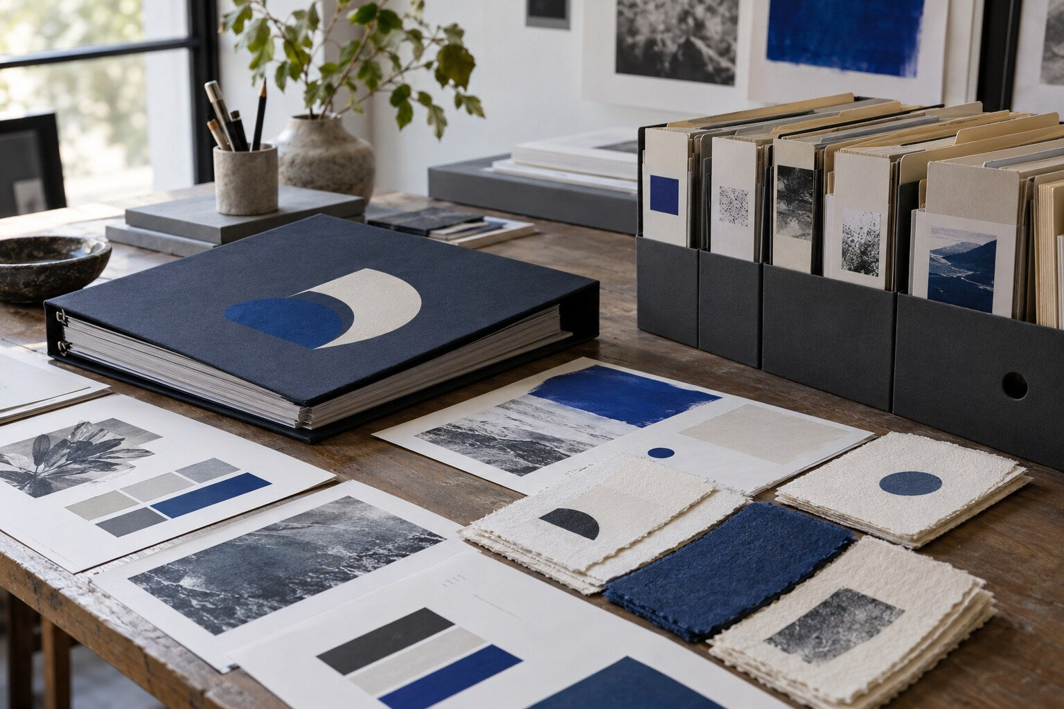
Delivery is organized around practical use: file formats, color modes, approved arrangements, spacing rules and application examples relevant to the agreed scope.
Short comments from early identity engagements. The feedback focuses on the work and process, without inflated claims or performance figures.
“The process gave us a clear direction without overcomplicating the decisions. Every file we received was organized and easy to use.”
Rachel Monroe / Founder, Northline Goods
“They listened carefully and turned a loose set of ideas into a visual system that actually feels consistent.”
Daniel Kim / Owner, Alder Row Coffee
“The identity feels considered in print and on screen. The guidelines are concise enough for our team to follow.”
Maya Brooks / Marketing Lead, Vela Home
“Communication was direct, revisions stayed focused, and the final mark works at the sizes we use every day.”
Ethan Ward / Principal, Ward & Field
“What stood out was the attention to production details. The packaging feels connected without every piece looking identical.”
Olivia Hart / Founder, Atelier Nine
“We came in with too many references and left with a clear visual direction. The process stayed calm and practical.”
Samuel Reed / Co-Founder, Bracken Studio
“The handoff was clean and usable. We understood which files to use and how to keep the identity consistent.”
Nina Patel / Marketing Director, Westbridge Wellness

Tell us what you are building and what you need your visual identity to do.
EMAILstudio@litomniacorp.comADDRESS271 W. Short St Ste 410 #2840Complete every field. This form displays a confirmation on the page and does not connect to an external submission service.